How we reduce User Confusion and Support Load
Context
I worked at Selectel, one of the leading cloud and data center service providers in Russia. I was responsible for the full user experience, including research and design, for the CDN and Cloud Storage products.
In this case, I want to share a story about one specific challenge we faced while improving the CDN product. At some point, we noticed a large number of support requests — over 40% of them were about the resource status. Many users didn't understand when the CDN becomes active, how to connect a custom domain, or how to check if the setup was completed successfully.
Research
I started by reviewing the full user path — from the product page to resource creation. I looked at how users behave and found points in the path where about 30% of customers drop out. Users of CDN are 2 segments business users(Website owners, course creators, small teams) and Technical users (Sysadmins, developers, DevOps engineers). The issue mostly affected non-technical users who relied on the UI instead of reading documentation.
I reviewed more than 2,000 support tickets and watched more than 100 user web sessions.
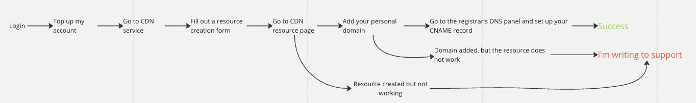
Users filled out the form, clicked "Create", didn’t see feedback, and got confused. Some saw a blocked button and didn’t know what to do.
Usability Testing
I prepare interactive prototypes and did usability testing with non-technical specialists. It was successful without critical difficulties.
Design
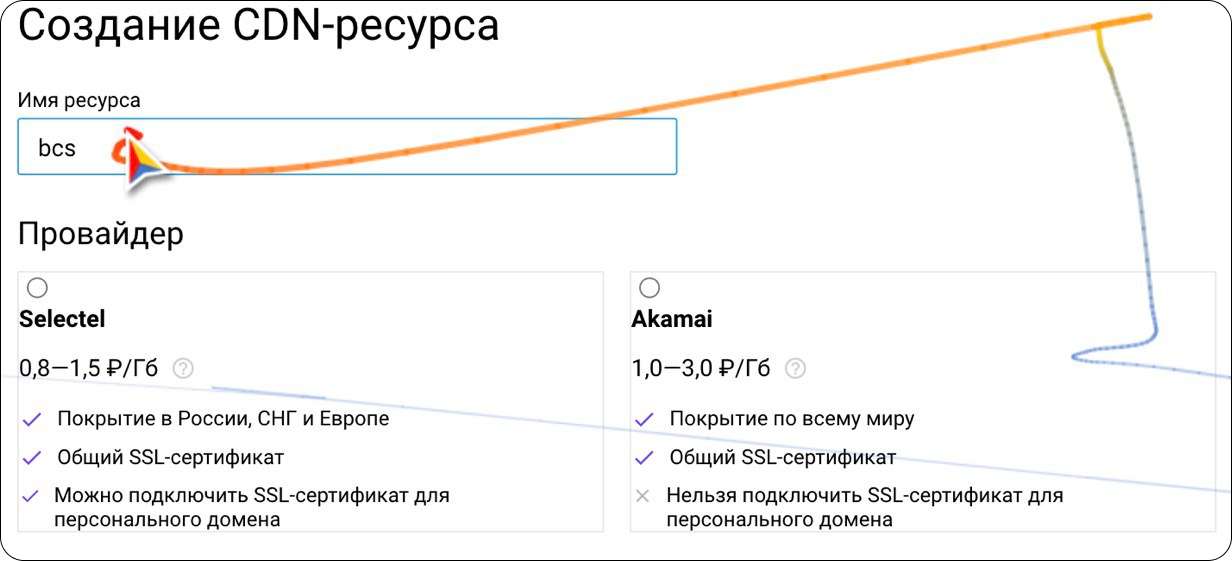
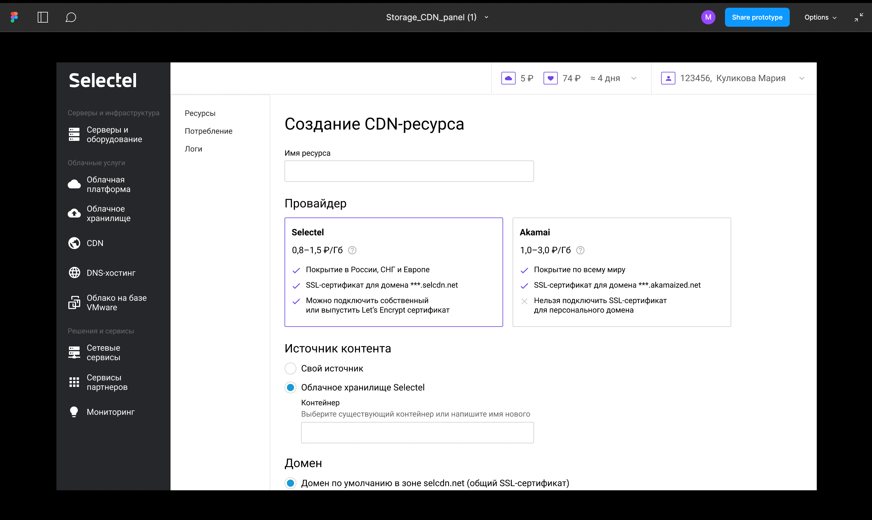
Improved the resource creation form
- Added fields for custom domain and SSL
- Made protocol selection automatic
- Added a low-balance warning
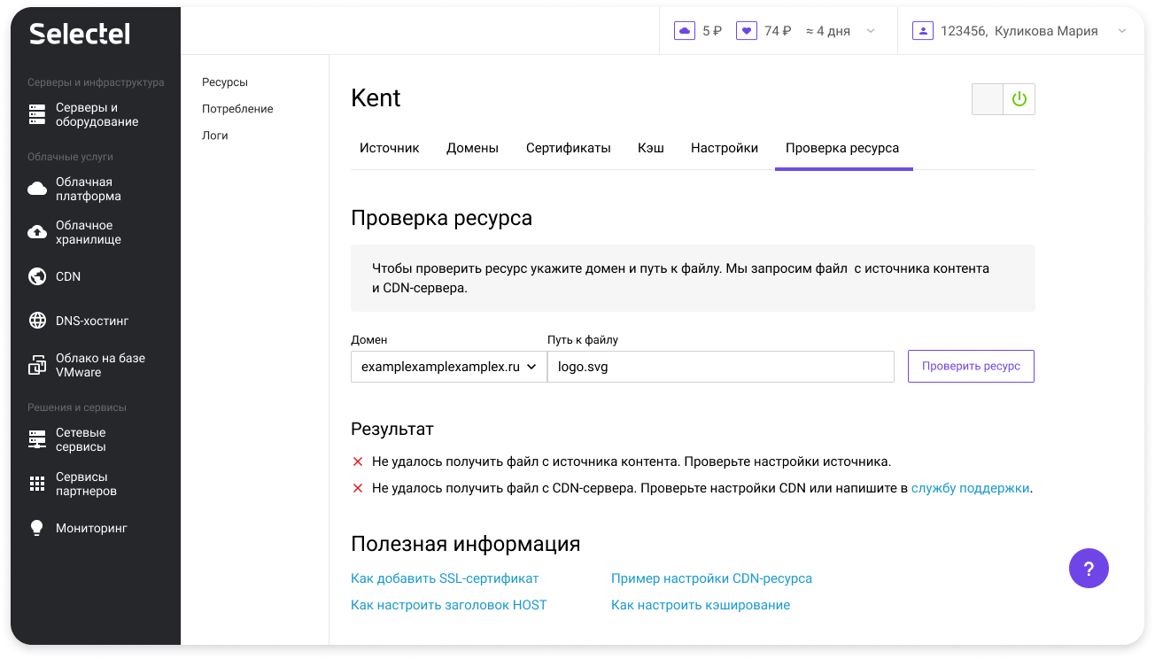
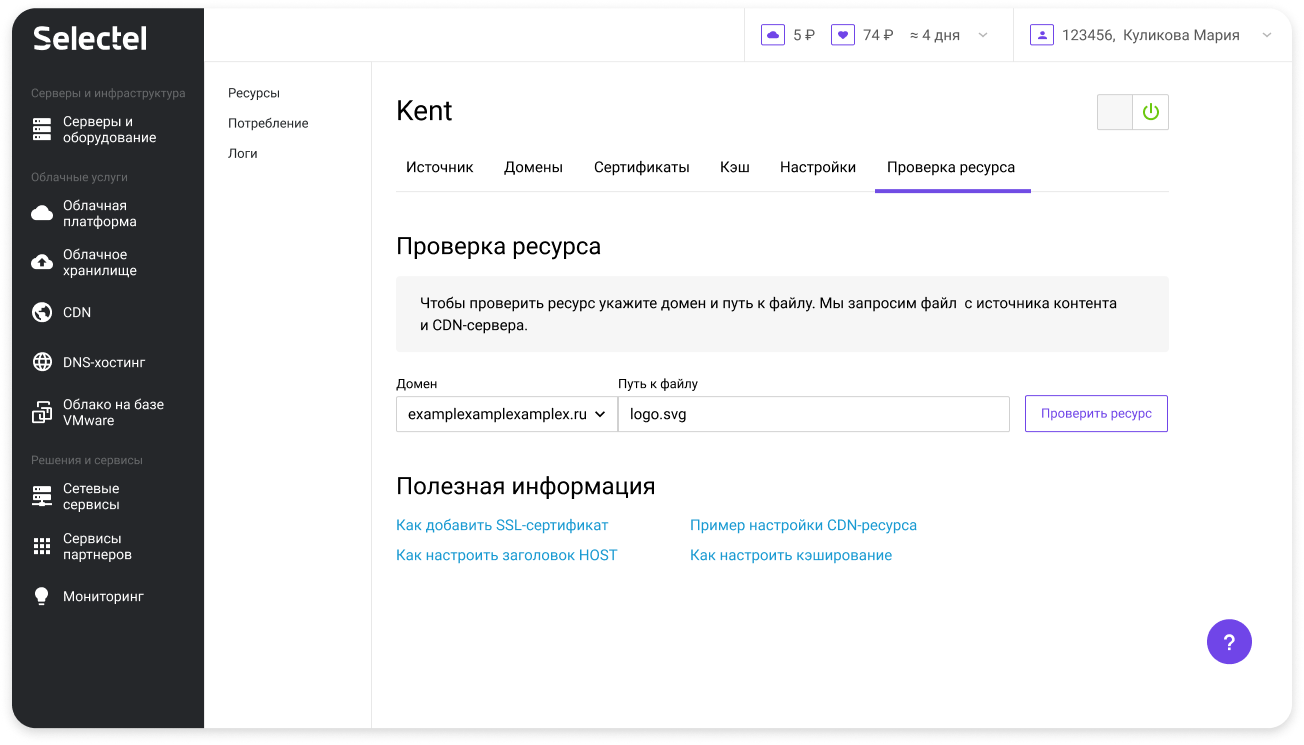
Added a verification screen
- Tips for configuring CNAME
- Help buttons with clear, short instructions
- A built-in checker to confirm setup status
Results
Support requests dropped from 40% to 10% A clear sign the new UI was easier to use
Faster support Team used built-in validation instead of external tools
Faster troubleshooting Users started sending screenshots of test results, making it easier to help